It’s a new year and that means new colour inspiration to guide your interior styling. We are looking at the biggest interior colour trends of 2022 from Farrow & Ball, Dulux and Pantone. We will show you which of our made to measure blinds can be used to inject the colour into your space and also which products will compliment your home if you’re going bold with a feature wall. This years colour predictions are an eclectic mix of distinctive yellow hues, the brightest sky blues, earthy greens and even a bold red.
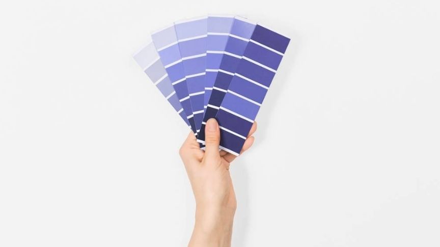
The big colour of 2022 is blue. Farrow & Ball, Dulux and Pantone have all selected a blue shade for home interiors this year. In recent years we have seen a rise in popularity of classic, dark blue interiors but this year we expect to see a move away to lighter and more softer hues. Stone Blue, Bright Skies and Very Peri are stunning shades that will introduce something fresh to interior styling for 2022.
Farrow & Ball have predicted 5 big colours of 2022 you’ll want to look out for- Babouche, School House White, Breakfast Room Green, Stone Blue and Incarnadine. Joa Studholme, Farrow & Balls colour curator has spoken about the colour predictions, 'there is something inherently human in the colours that we are attracted to for 2022 as well as in the way we use them. They are an eclectic mix of the pure and the humble that evokes the warmth and harmony of a more innocent age while celebrating life today. Function goes hand in hand with ornament, using colours and finishes in unusual ways to celebrate the principles of utility, kindness and honesty.’
Let’s delve a little deeper and take a look at each of the colours.
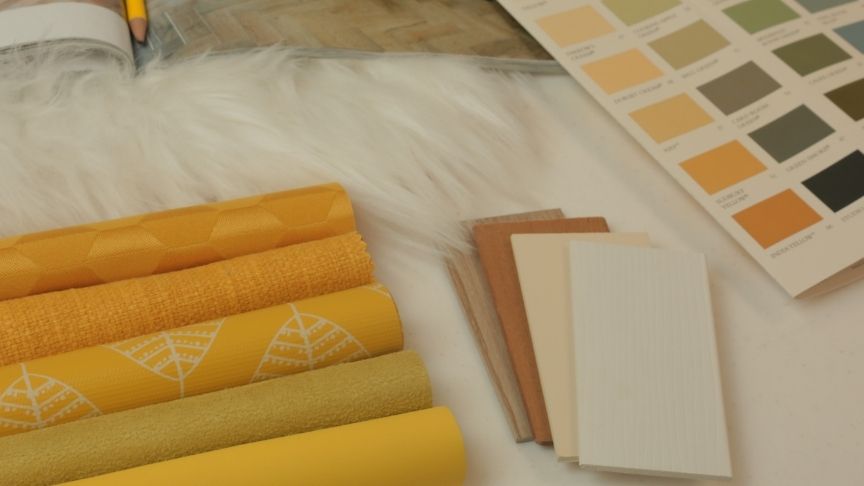
Farrow & Ball - Babouche No.223
Named after the distinctive colour of the leather slippers worn by men in Morocco. It’s a bold, happy shade that will lift the feel of your interiors. Babouche yellow works well as a splash of colour when paired with natural and neutral tones. It pairs beautifully with wooden tones throughout your home. Yellow made to measure blinds are a great way to introduce the colour, keep the rest of your palette neutral or opt for complimentary shades such as sage greens or muted greys.
If you’re not afraid of colour you could go for a feature wall and pair with oak coloured wooden blinds and natural wooden toned furniture. Babouche compliments different grey tones and will create a cool, contemporary feel in your home when paired with light greys and anthracite shades.
Introduce Babouche into your interior styling using our Solar Yellow or Luna Yellow made to measure blinds.
Farrow & Ball - School House White No.291
Your new go to neutral shade. School House White is a soft, off white shade. As a contrast to the bright whites of previous years this chalky shade will allow you to introduce white into your home without making it look too clinical. A great base shade to work with, adding surprising warmth to your home.
Described by House Beautiful as ‘A pared-back shade without the cool undertones of the more contemporary neutral groups’.
School House White compliments so many interior trends and will work well in spaces of all sizes. Texturing is going to be huge in 2022 and we think this colour will play a key role in that trend. Keeping things fuss free and allowing you the freedom to introduce woods, fabrics and even metallics without overwhelming the finished look. We especially love this colour with Breakfast Room Green for 2022. Use soft creams and off white shades to get the look for your home.
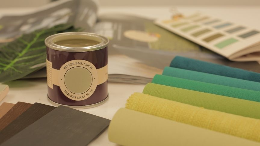
Farrow & Ball - Breakfast Room Green No.81
Described by House Beautiful as the most cheerful of all the Farrow & Ball greens, Breakfast Room Green will inject a fun and lively green hue into your space. It also provides a really luxurious finish for your space. It’s a timeless green that will look good in your interiors for years to come. Greens always give that feeling of nature being within our home, it helps keep us centred and calm.
We love this shade paired with soft whites, neutral shades. It works well with wooden furniture pieces including our wooden blinds.
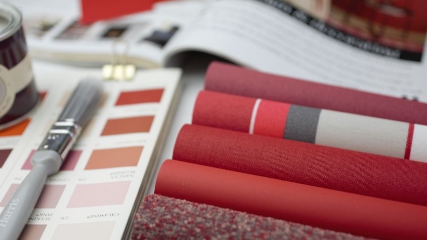
Farrow & Ball - Incarnadine No.248
Not for the fainthearted, Incarnadine is the richest crimson red shade. A colour full of depth that will dominate the look and feel of a space. This shade will work well in dining and living spaces. Red is an ambitious colour choice and said to be especially good for creative spaces and offices.
Incarnadine shades are great paired with blue and white shades. Contemporary darker grey shades also look really good styled with crimson red shades. Our red blinds and curtains will give your home a fab 2022 upgrade.
All the blues...
Across the board blue shades seems to be the biggest influence on the predicted colours for this year. It’s easy to see why as blue shades are known for bringing calm and positive vibes to the space. After the last couple of years, it’s the update every home and family is looking for.
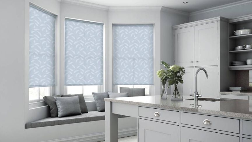
Farrow & Ball - Stone Blue No.86
Stone Blue is a cool, contemporary yet timeless shade of blue. Named after the indigo pigment which was often imported in lumps in the 18th century. It will bring an air of sophistication to your home interiors. It’s a really workable shade and great for creating an understated statement look in your home. As with each of the shades picked for 2022 it works well with cool greys and muted neutral shades. This makes it easy to incorporate or update your existing decor with this new cool shade.
To get the look in your home with our made to measure blinds and curtains, shop Teal coloured fabrics.
Dulux- Bright Skies
Dulux’s colour of the year is Bright Skies, a stunning sky blue hue. Bright Skies is a bright, positive colour for 2022. After a rocky couple of years we are all looking forward to a brighter future now & this shade is the embodiment of that feeling. It’s a fun colour to inject into your home as a standalone shade or as part of a subtle colour palette including neutrals and soft green shades. Unlike the darker tones of previous years, Bright Skies will keep your home light and airy feeling. Perfect for even the smallest of spaces.
When speaking about the chosen shade of 2022, Dulux said, ‘Bright Skies ™ is a light, airy and optimistic blue that’s good for the soul. It promises to open up and revitalise your home.’
Pantone-Very Peri
Very Peri is described by Pantone as 'a dynamic periwinkle blue hue with a vivifying violet-red undertone that blends the faithfulness and constancy of blue with the energy and excitement of red' – it's a colour promising to bring joy as the 'happiest and warmest of all the blue hues'. It’s a unique colour, definitely part of the blue family but with undertones of lavender. It was created as a new colour especially for 2022. Designed to recognise the need for hope in the times we live in. It’s a beautiful shade and will work wonderfully in home interiors.
When styling Very Peri within the home, as with most bold colours, it will work really well as a colour accent when paired with whites and neutral shades. Pairing with beige and cream shades will keep the feel of the space warm and welcoming. It also compliments grey palettes and can easily update the feel of grey styled homes.
We’d love to see pictures of your home once you’ve fitted our blinds. Don’t forget to tag us and use the hashtag #sharewithswift for the chance to feature in our marketing materials. You can also be in with a chance of winning a £50 swift voucher! You have nothing to lose… just don’t forget the hashtag #sharewithswift T’s & C’s apply.